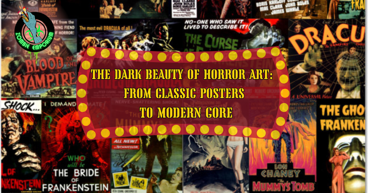
The Dark Beauty of Horror Art: From Classic Posters to Modern Gore

This post may contain affiliate links. As an Amazon Associate, I earn from qualifying purchases.
The Dark Beauty of Horror Art: From Classic Posters to Modern Gore
Horror has always been more than fear.
It’s atmosphere.
It’s seduction.
It’s art.
From the elegant menace of early movie posters to today’s unapologetic, gore-soaked illustrations, horror art has evolved alongside the genre itself, reflecting society’s anxieties, taboos, and obsessions.
This is the story of how horror became beautiful.

The Gothic Roots of Horror Art
Early horror visuals were steeped in gothic tradition. Posters relied on:
- Dramatic shadows
- Hand-painted typography
- Romanticized monsters
Films like Dracula and Frankenstein presented monsters as tragic figures, elegant, tortured, and strangely alluring.
These images weren’t about shock.
They were about mood.
Dark castles, flowing capes, and haunting gazes invited viewers into a world where terror was wrapped in beauty.

The Golden Age of Horror Posters
By the mid-20th century, horror posters became bolder and more provocative. Studios leaned into:
- High-contrast colors
- Sensational imagery
- Emotional exaggeration
Posters for films like The Texas Chain Saw Massacre and zombie cinema such as The Dead Are Alive embraced shock, provocation, and confrontation selling horror as an experience audiences weren’t supposed to look away from.
Horror posters no longer whispered.
They dared.

When Horror Art Got Louder (and Bloodier)
As censorship loosened and audiences hardened, horror visuals followed.
The late ’70s and ’80s brought:
- Slasher aesthetics
- Exploitation poster art
- Graphic promises of violence
Films like The Texas Chain Saw Massacre along with landmark zombie cinema such as Dawn of the Dead pushed horror art into uncomfortable, confrontational territory, paving the way for gore to be used as expression rather than excess.
This was no longer romantic fear this was confrontational horror.
Posters dared audiences to look away… and dared them not to.
Modern Horror Art: Gore as Expression
Today’s horror art embraces contradiction.
It can be:
- Minimalist or grotesque
- Beautiful and disturbing
- Clean design hiding brutal ideas
Modern posters and illustrations often use gore symbolically, not just for shock. Blood becomes texture. Decay becomes composition. Violence becomes commentary.
This evolution mirrors modern horror itself more psychological, more self-aware, and more willing to blur the line between art and revulsion.
Why We Find Horror Art Beautiful
Horror art allows us to:
- Face fear safely
- Explore taboo visually
- Find meaning in darkness
There’s a strange comfort in controlled terror. Beauty gives us permission to look. Horror gives us a reason to feel.
This tension is why horror imagery endures and why it continues to evolve.
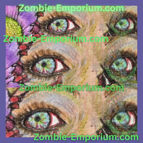
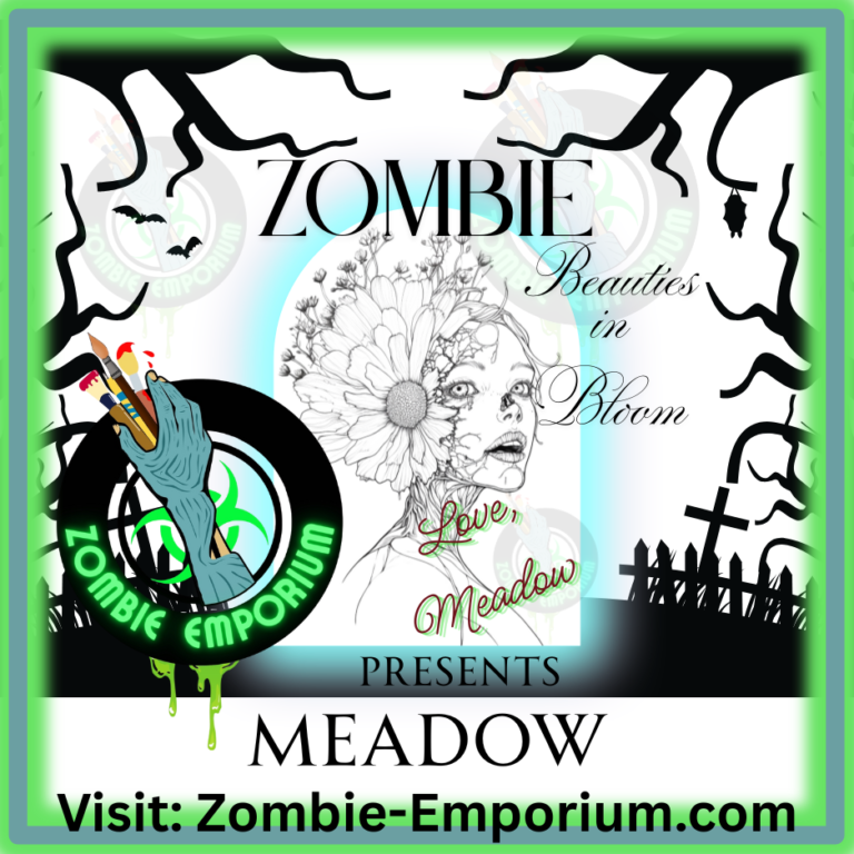
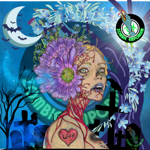
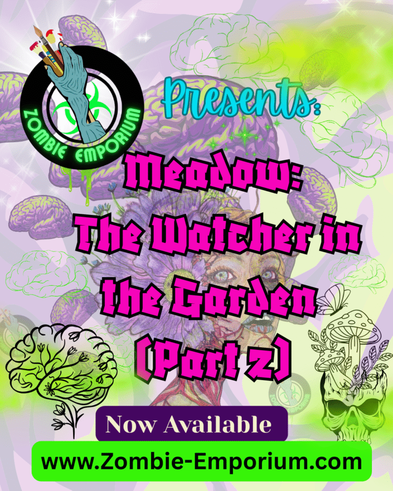
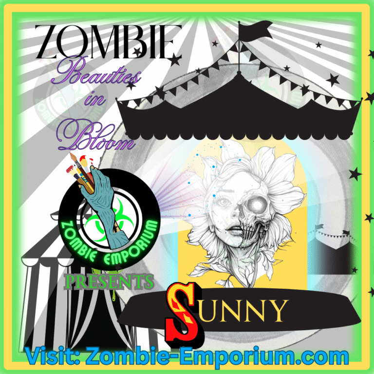
Horror Art Lives On at Zombie Emporium
At Zombie Emporium, horror art isn’t just decoration it’s storytelling.
From illustrated undead to floral gore and gothic aesthetics, modern horror art carries the legacy of classic posters while pushing into new, unsettling territory.
For more explorations into horror visuals, film history, and undead aesthetics, visit The Undead Journal.

Final Thoughts from The Undead Journal
Horror art has never been about ugliness alone.
It’s about contrast.
It’s about fascination.
It’s about finding beauty where others refuse to look.
And that perhaps …. is the darkest beauty of all.
For Horror Fans & Collectors
For Horror Fans: Horror posters aren’t just marketing they’re part of how fans interact with the genre. One fun way to explore horror history is through interactive collectibles, like a scratch-off horror movie poster featuring 100 iconic films. It’s a visual way to track what you’ve seen, discover classics you missed, and celebrate the genre beyond the screen.
*All film imagery used for editorial and commentary purposes only.